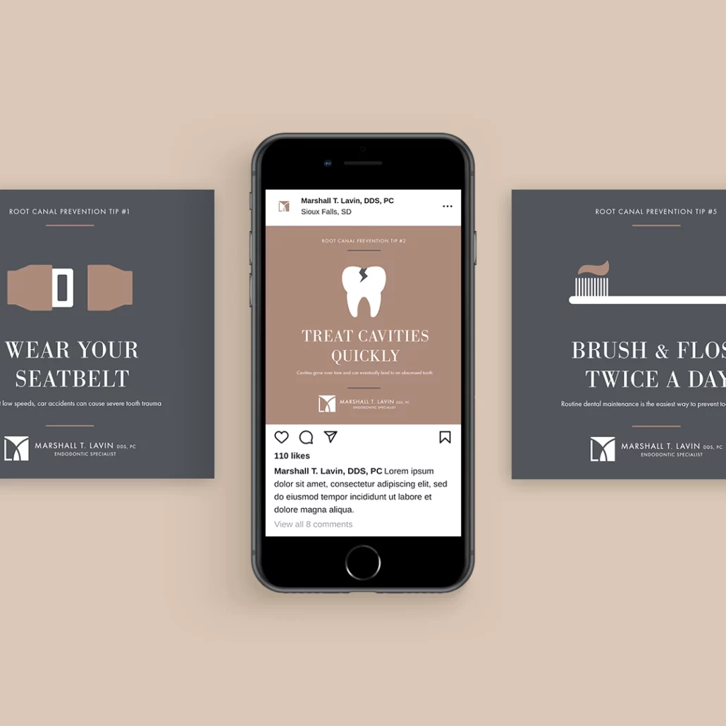
Marshall Lavin is an endodontic specialist in Sioux Falls whose brand needed a refresh. After one meeting with with him, it was obvious that he had a refined taste and a classic sense of style. The brand refresh was inspired by high-end luxury brands and reflected the attention to detail and high level of care that Dr. Lavin strives to provide to each patient.
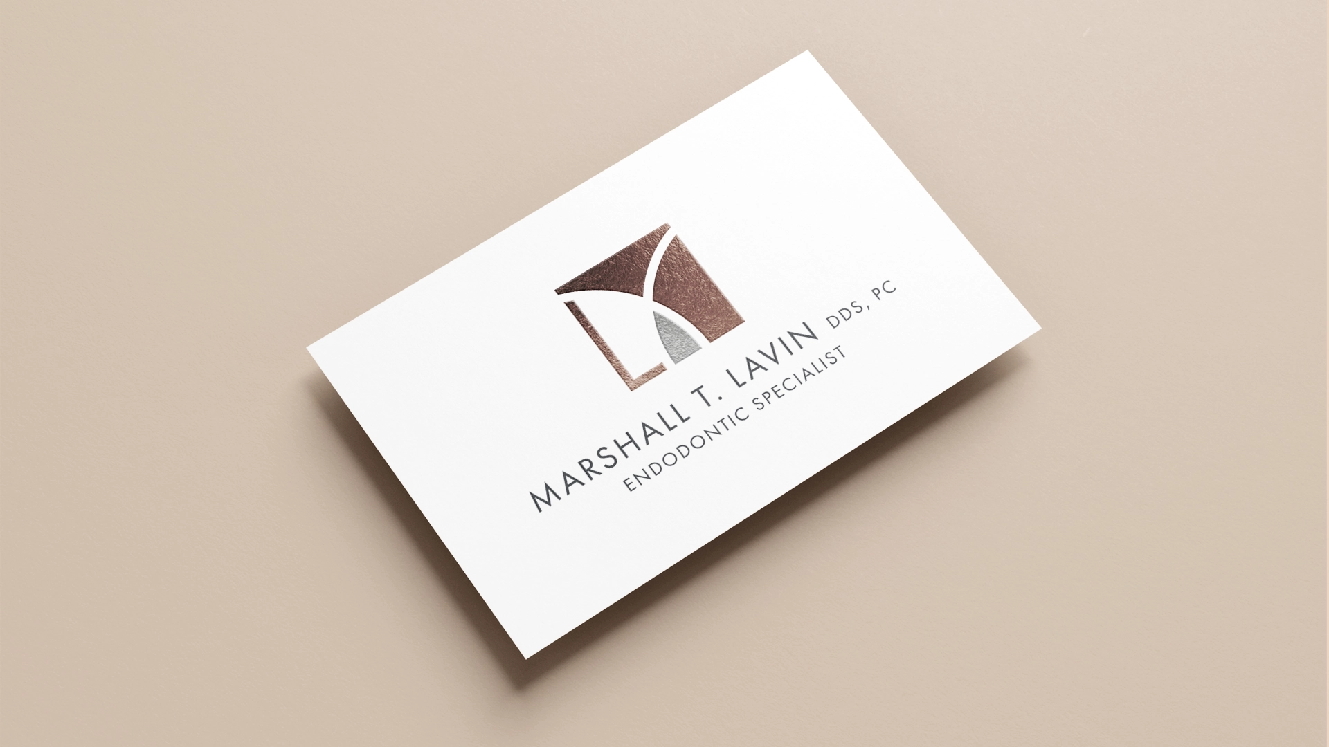
Dr. Lavin liked his current logo, it just needed a bit of an update. I refined the geometry a bit and simplified the entire mark so that it felt more open and airy. I wanted the logo to feel less dental and more like a luxury fashion brand, so I also wanted it to be a monogram. The previous logo already featured an “M” shape, but I separated the lower left corner to create an “L.”
I also wanted to emphasize the carat shape in the middle because it related the logo back to the idea of extraction, so when I recolored the logo, I made that the only piece in an accent color so that it stood out. The overall color palette for the refreshed brand combined warm and cool colors and was inspired by precious metals.
Headings
Subheadings
Body Text
Rose Gold
Sand
Espresso
Marsala
Charcoal
Pewter
Silver
Oxford Blue
+ Website
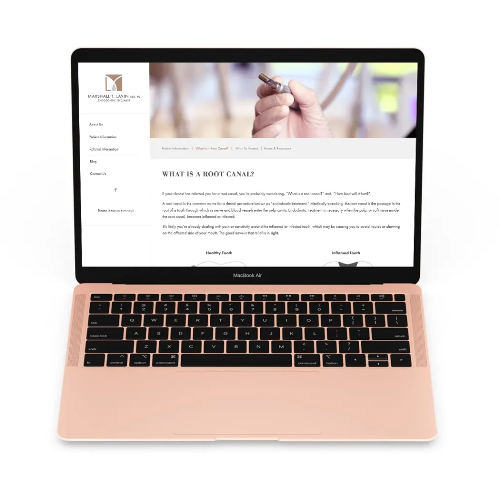
I also redesigned the website to make it feel cleaner and more modern. I wrote new content that gave patients more information about what to expect during their root canal so that they could feel more at-ease going into their appointment.