HopeWood Outdoors
+ Background
HopeWood Outdoors, formerly known as Lutheran Outdoor Ministries of Ohio, is a group of campsites focused on environmental education for all ages. They were searching for unified identity that was more inclusive and expressed where the organization was at the present.
- branding, collateral design, logo design, website design
+ Logo and Identity
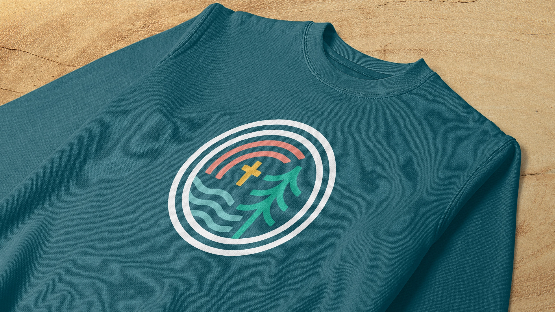
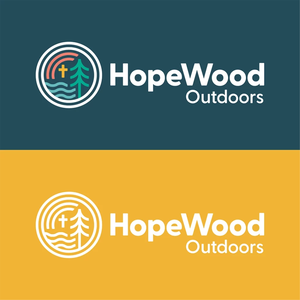
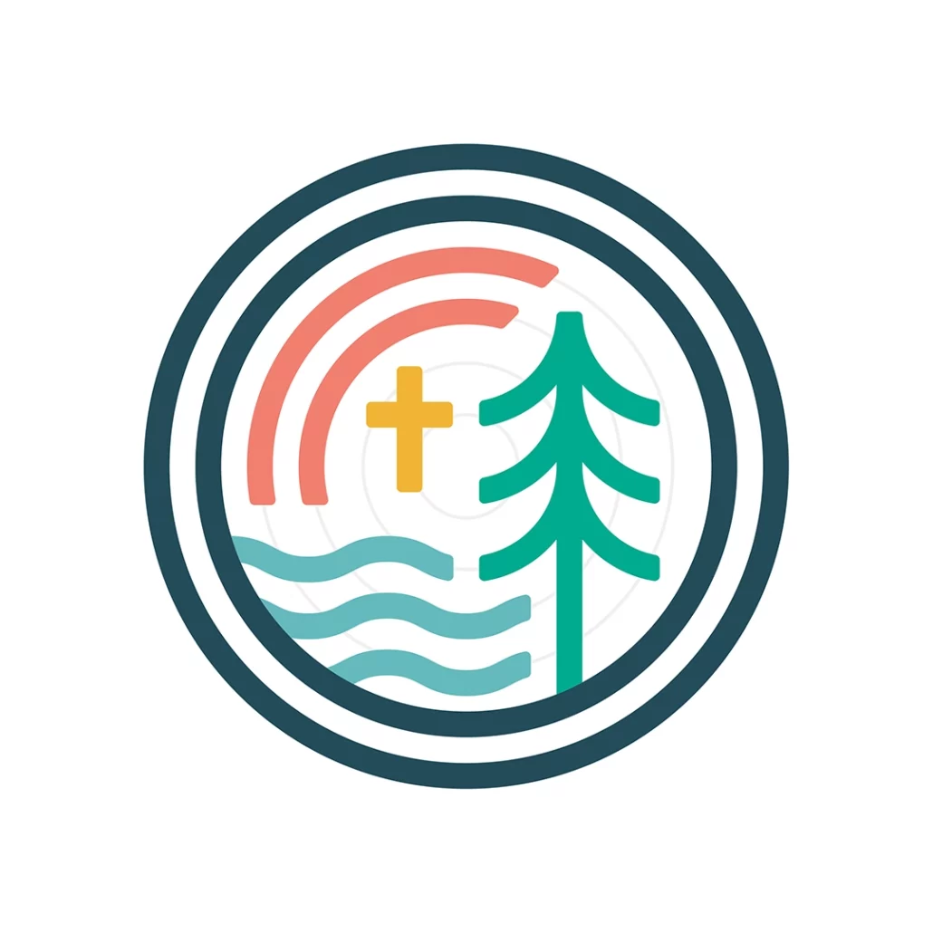
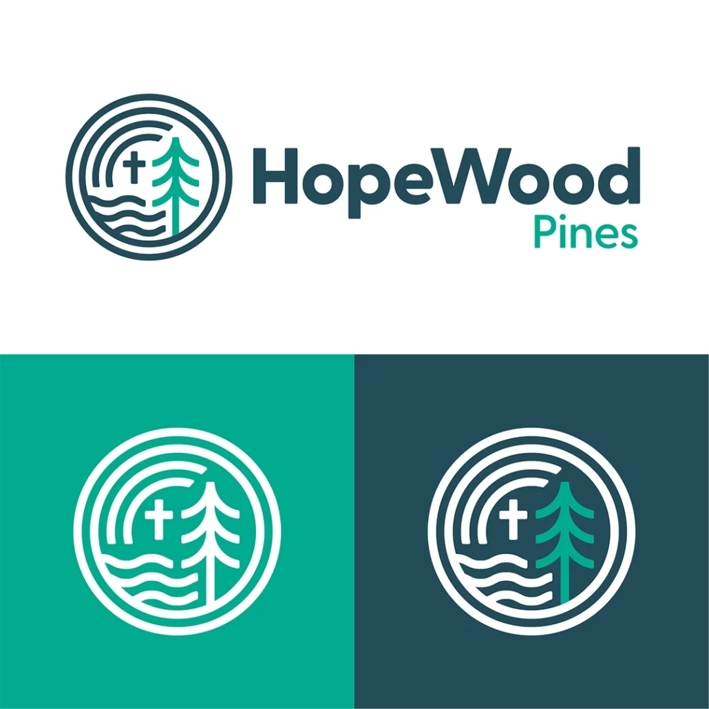
The new name, HopeWood Outdoors, was born out of the idea of the heartwood—the dense, strong core at the heart of the pines that surround the camps. Based on this idea, the logo was built on a grid of concentric circles like the rings of a tree.
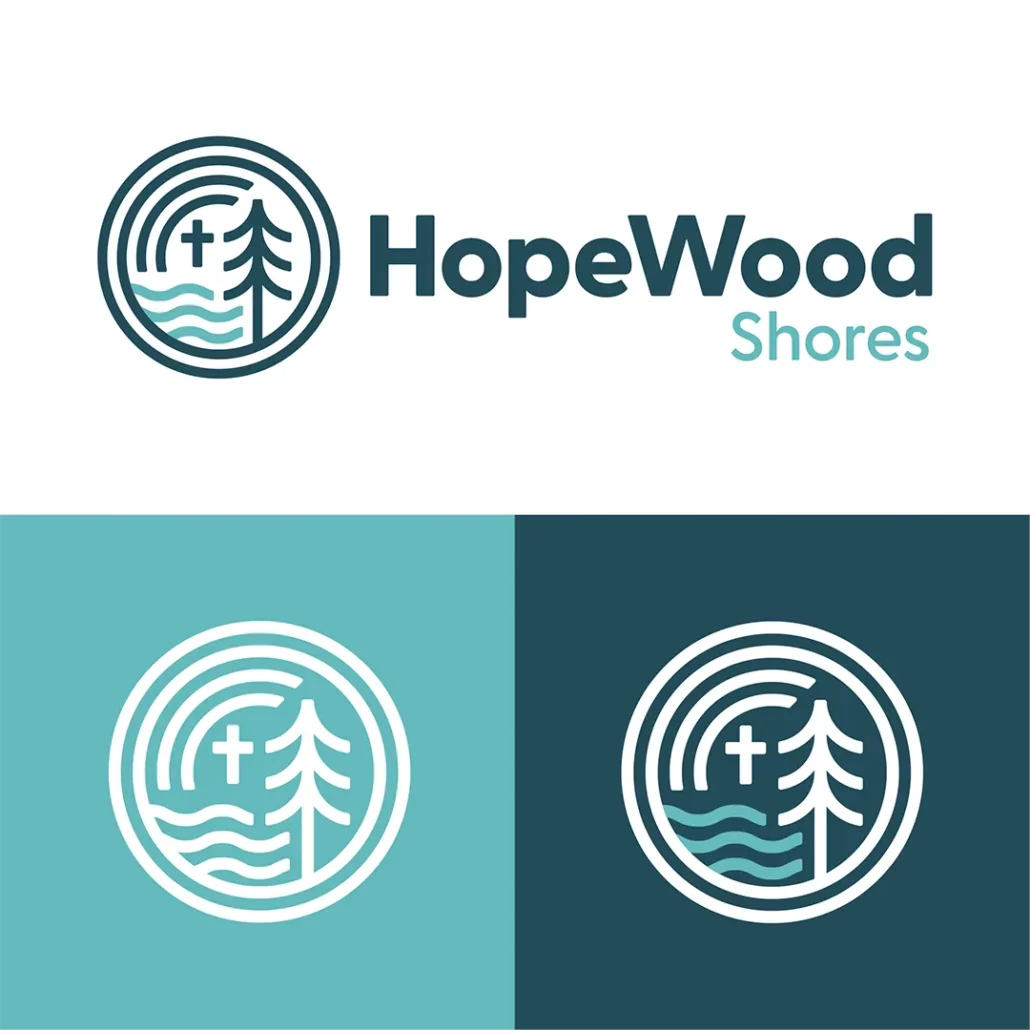
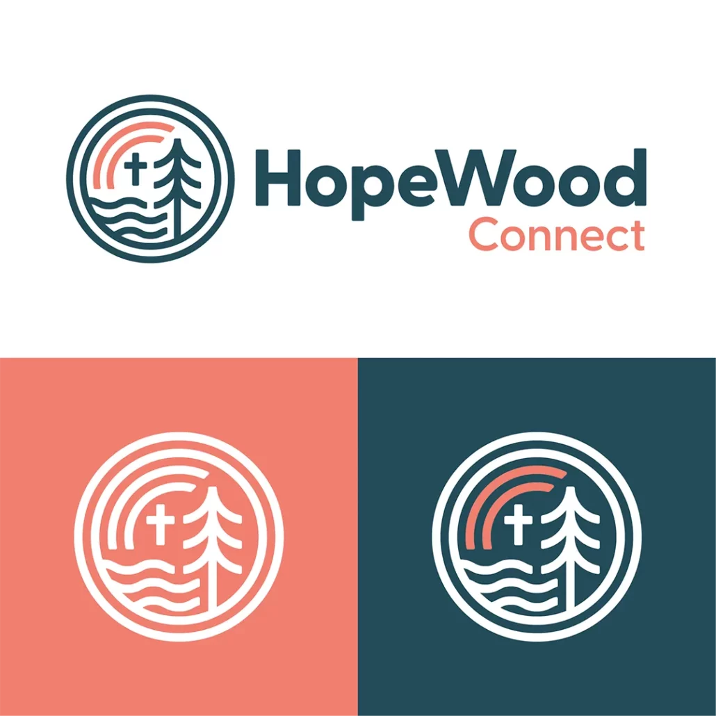
One of the issues presented to us was that each site had its own distinct name and logo that needed to be unified under a single brand. I designed the logo to be modular so that it could be adapted to each site. HopeWood Pines (formerly known as Lutheran Memorial Camp) is located deep in the forests of central Ohio and is represented by a pine tree. HopeWood Shores (formerly known as Camp Luther) is on the shores of Lake Erie and is represented by water. HopeWood Connect, an outreach program that travels to local schools and churches, is represented by a rainbow. Each site has its own primary color and the umbrella brand of HopeWood Outdoors combines all colors and logo logo elements.



+ Website
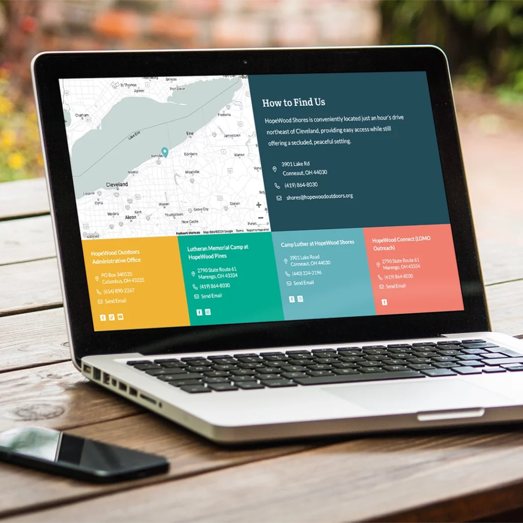
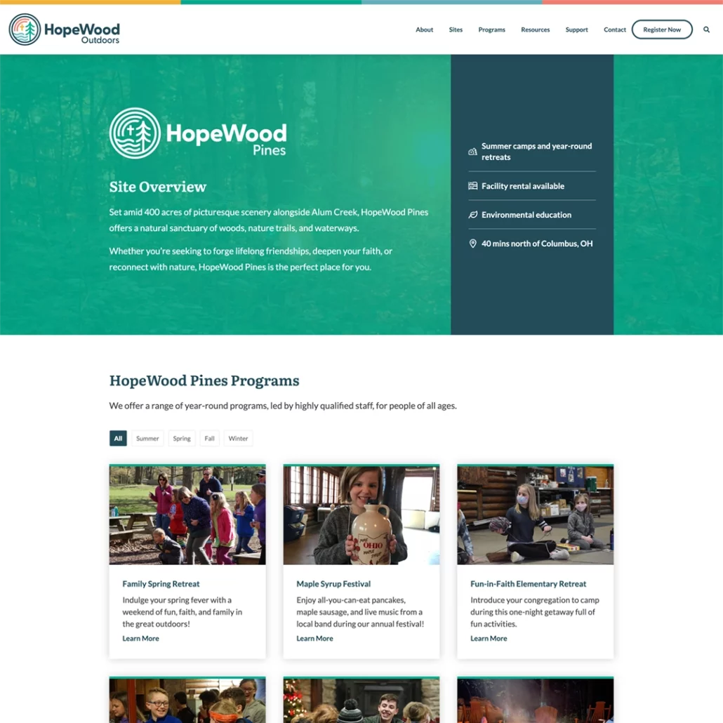
Like the brand as a whole, the goal of the website redesign was to make all of the programs offered by HopeWood Outdoors feel unified. The website allows users to not only discover programs based on site, but also by age group and season to allow for more cross-pollination between the sites.
Another consideration for the website design was the increased need for facility rental. The new website features detailed breakdowns of the different options and amenities available at each site and makes it easier for users to choose between them.
