The Gathering Well is a nonprofit based in Sioux Falls, SD, that provides education, support, and community for families of adopted and foster children. Originally a branch of another nonprofit, they decided to branch out into their organization which meant they needed everything from a name to a logo to a website.
After a naming exploration, the name The Gathering Well struck a chord with the founders of the organization. The name comes the long historical tradition of wells being a place for women to gather and socialize. It was a shared community resource to draw sustenance from deep under the ground. The water from the well also symbolizes new beginnings, such as bringing a child into a new family. The name also has a double meaning referring to someone’s emotional and mental wellbeing.
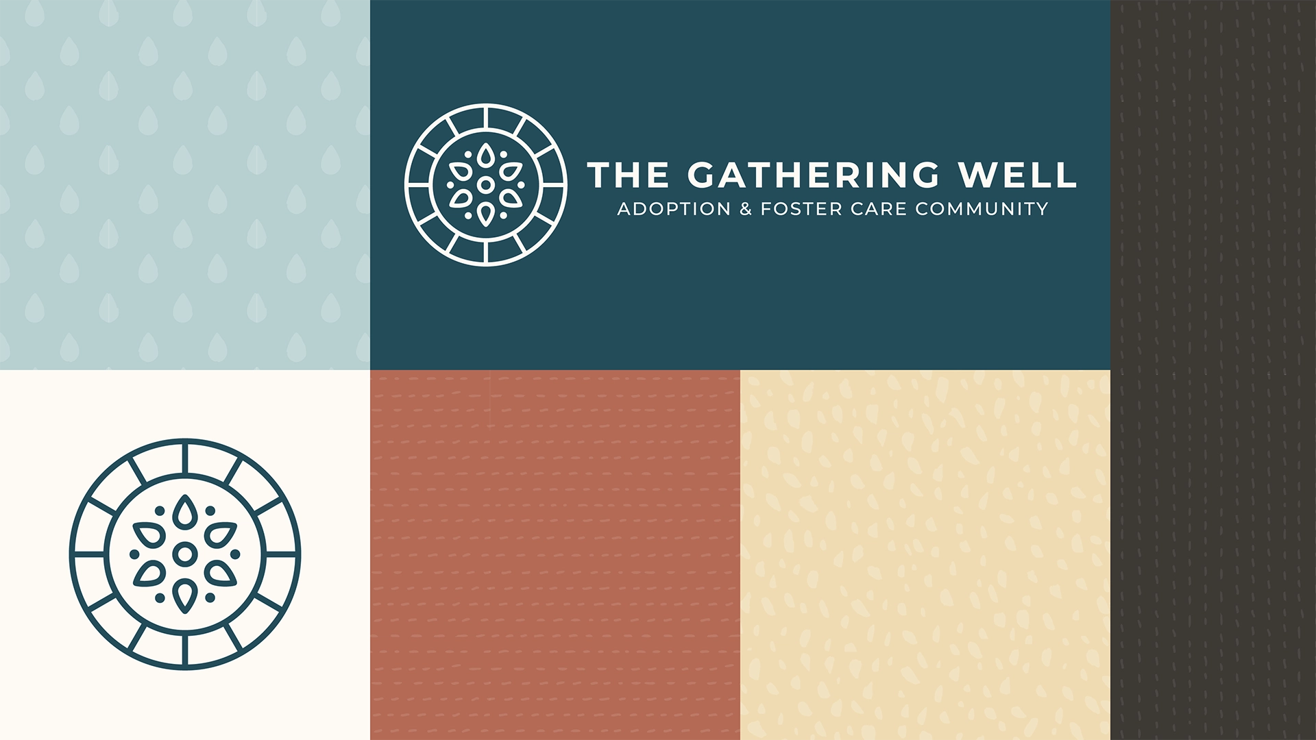
The brand elements express this idea with a logo that symbolizes drops of water coming together inside a well and a color palette inspired by stones and water. The brand was also inspired by the idea of patchwork quilts that weave together different texture and patterns, much like a blended family. The overall effect is warm and inviting—a place families can feel at home.
Headings
Subheadings
Body Text
Marine Blue
Ripple Blue
Clay
Sand
Pearl
Pebble
+ Website and Collateral
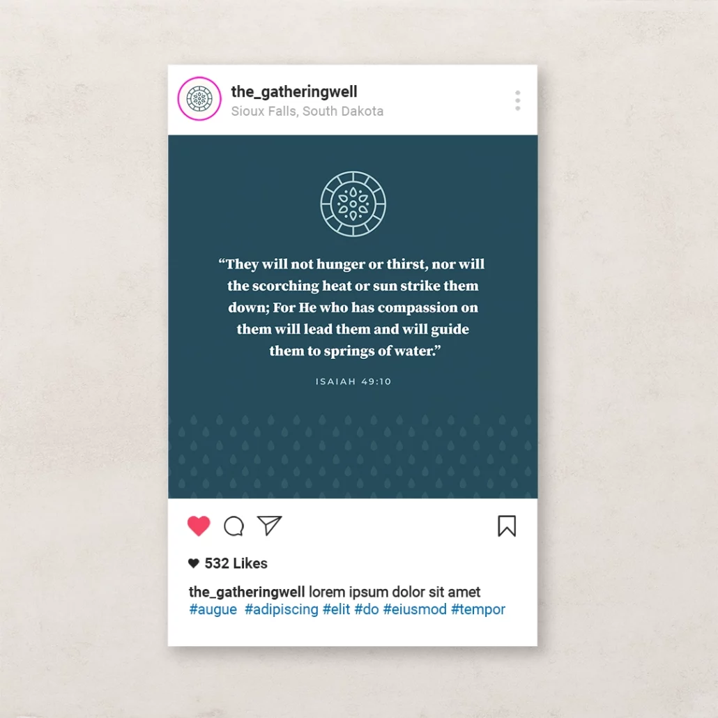
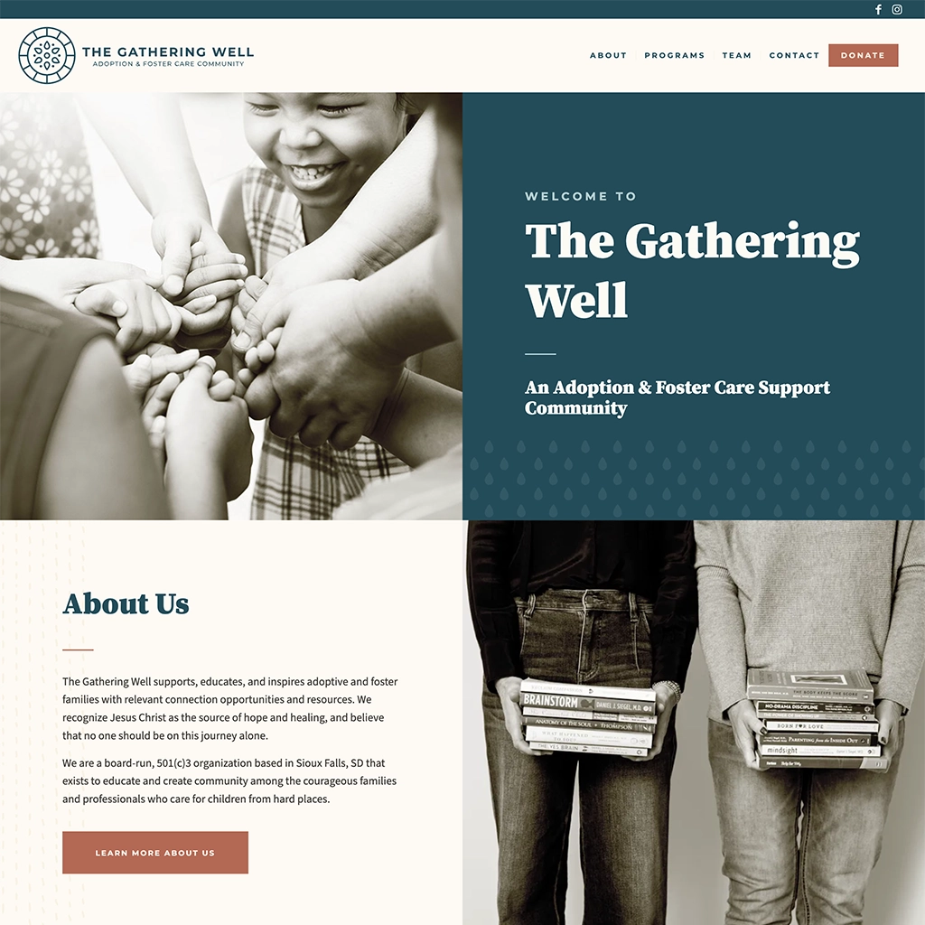
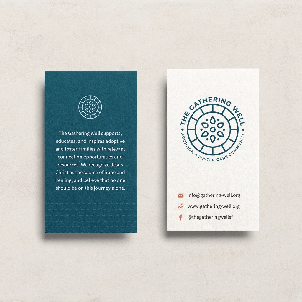
Because The Gathering Well is a small nonprofit, I created marketing tool kit for their team of volunteers to use to maintain consistent branding. The kit included templates for social media posts, presentations, and documents. I also developed a website for them and trained their team on how to use it.