HopeWood Outdoors, formerly known as Lutheran Outdoor Ministries of Ohio, is a group of campsites focused on environmental education for all ages. They were searching for unified identity that was more inclusive and expressed where the organization was at the present.
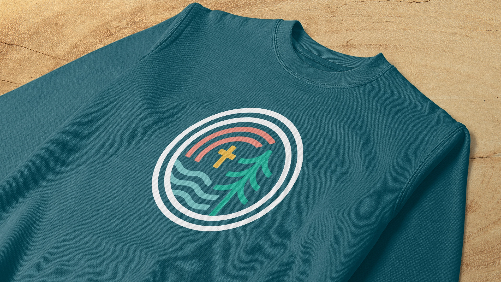
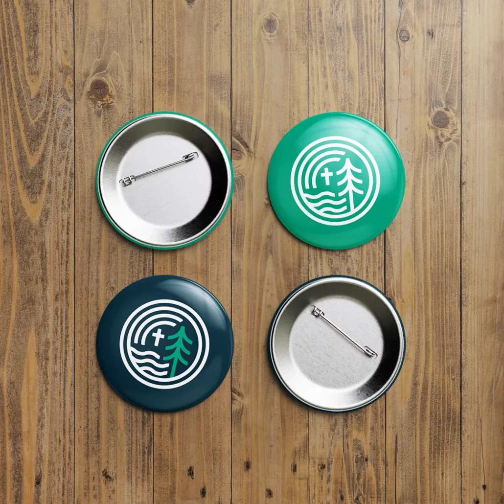
The new name, HopeWood Outdoors, was born out of the idea of the heartwood—the dense, strong core at the heart of the pines that surround the camps. Based on this idea, the logo was built on a grid of concentric circles like the rings of a tree.
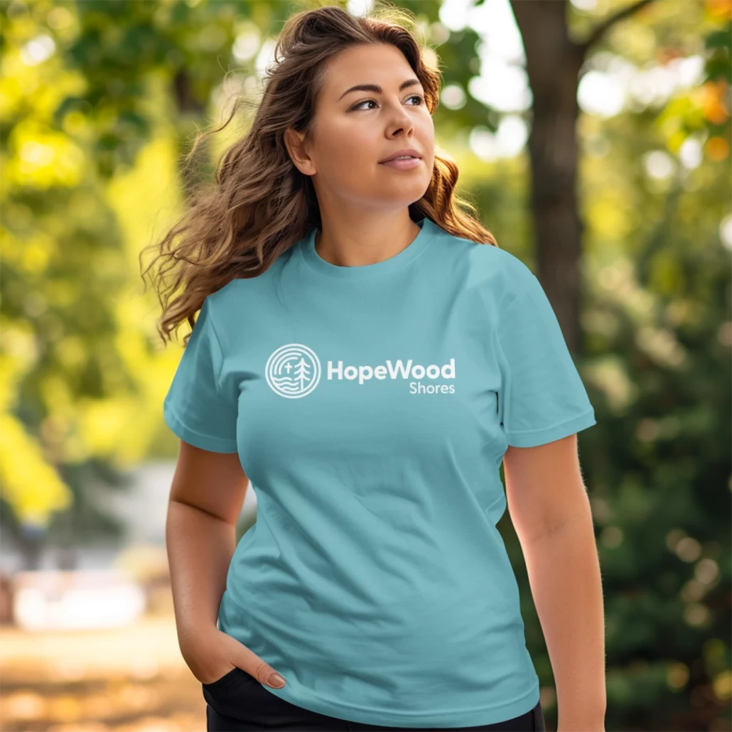
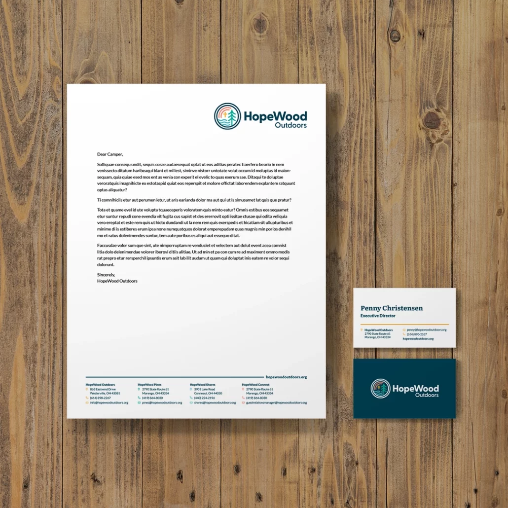
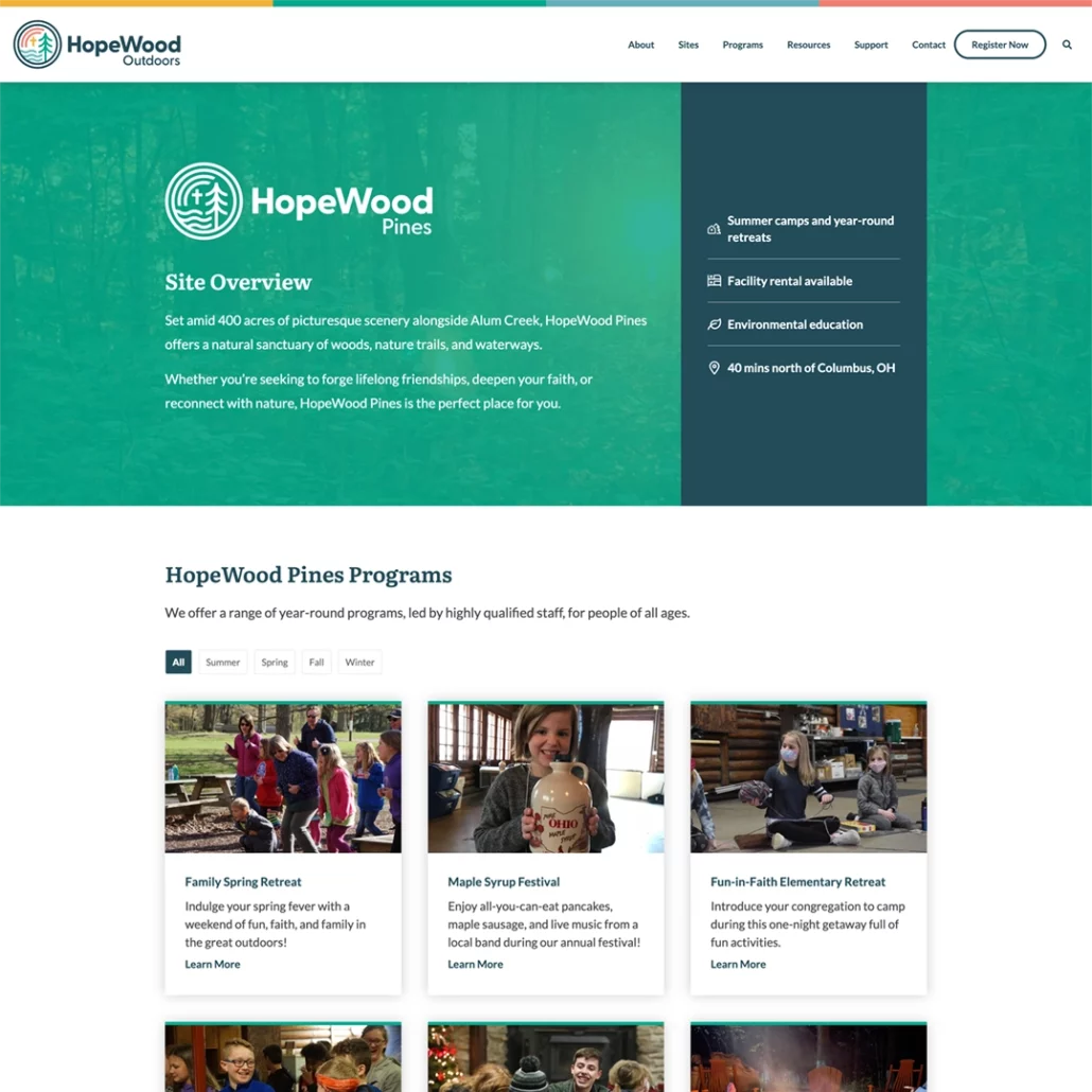
One of the issues presented to us was that each site had its own distinct name and logo that needed to be unified under a single brand. I designed the logo to be modular so that it could be adapted to each site. HopeWood Pines (formerly known as Lutheran Memorial Camp) is located deep in the forests of central Ohio and is represented by a pine tree. HopeWood Shores (formerly known as Camp Luther) is on the shores of Lake Erie and is represented by water. HopeWood Connect, an outreach program that travels to local schools and churches, is represented by a rainbow. Each site has its own primary color and the umbrella brand of HopeWood Outdoors combines all colors and logo logo elements.
Headings
Body Text
Starry Night
Sunshine Gold
Leaf Green
Sky Blue
Sunset Coral
+ Website
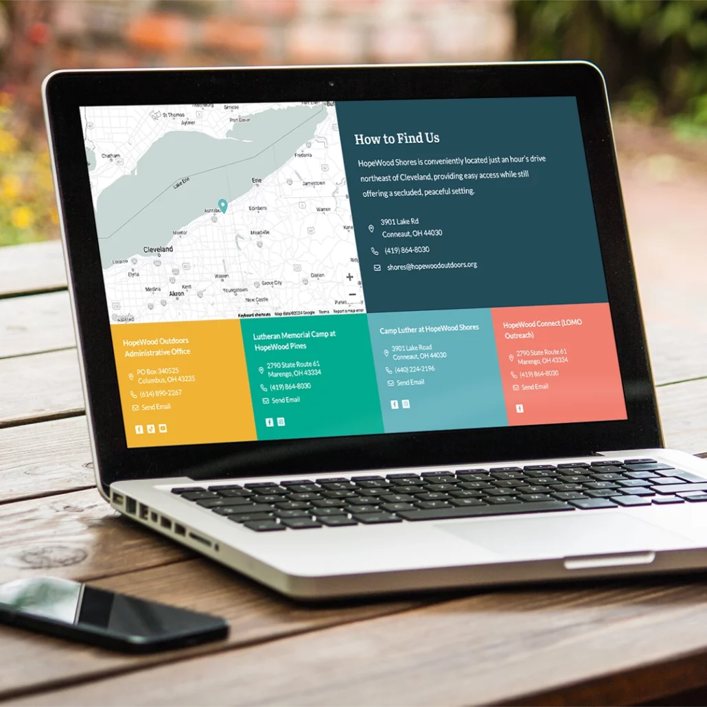
Like the brand as a whole, the goal of the website redesign was to make all of the programs offered by HopeWood Outdoors feel unified. The website allows users to not only discover programs based on site, but also by age group and season to allow for more cross-pollination between the sites.
Another consideration for the website design was the increased need for facility rental. The new website features detailed breakdowns of the different options and amenities available at each site and makes it easier for users to choose between them.
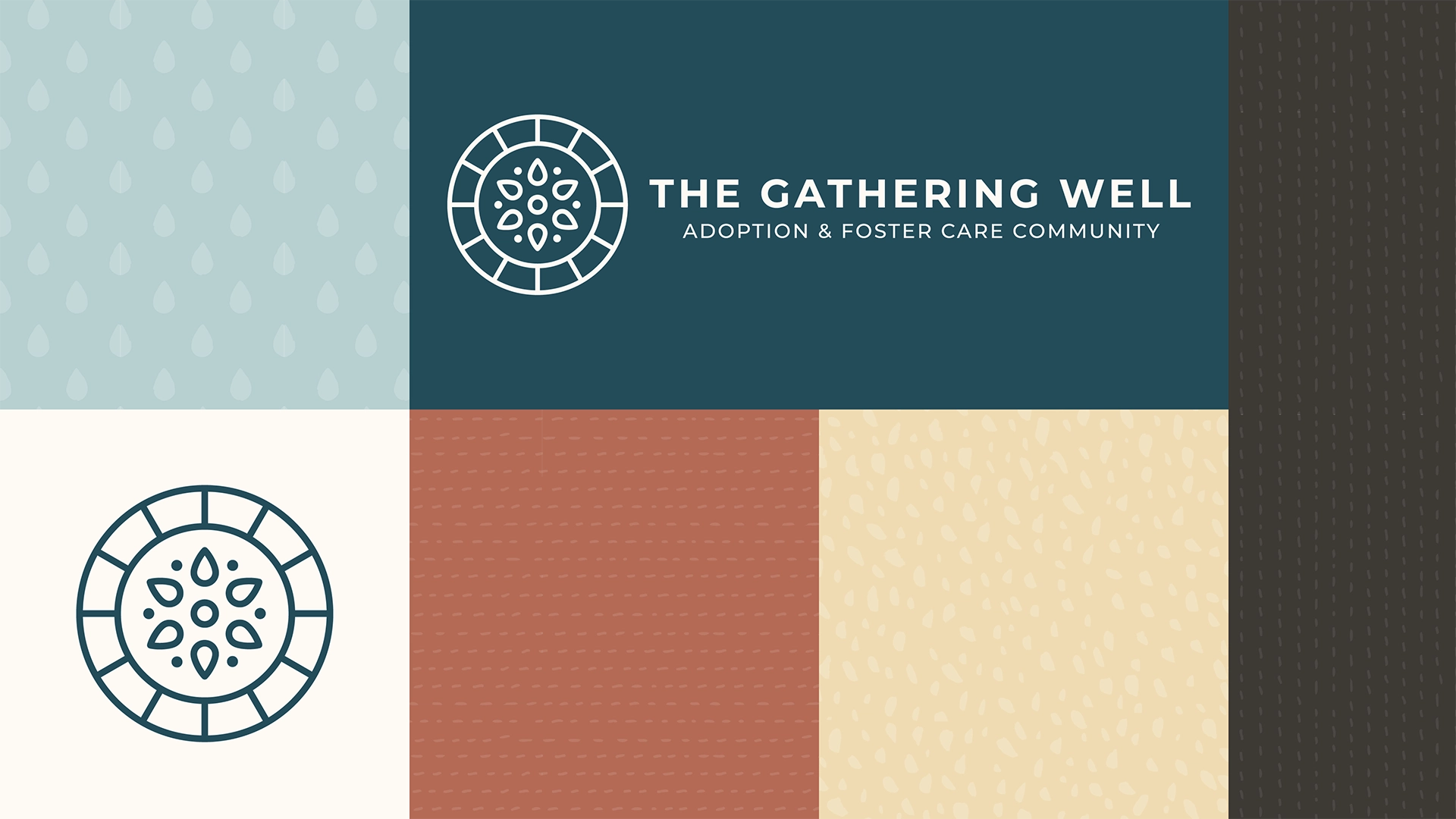
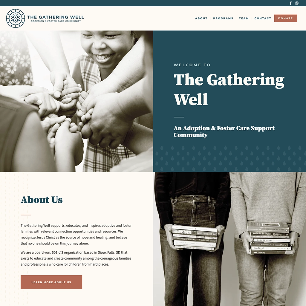
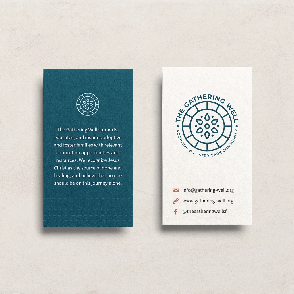
The Gathering Well is a nonprofit based in Sioux Falls, SD, that provides education, support, and community for families of adopted and foster children. Originally a branch of another nonprofit, they decided to branch out into their organization which meant they needed everything from a name to a logo to a website.
After a naming exploration, the name The Gathering Well struck a chord with the founders of the organization. The name comes the long historical tradition of wells being a place for women to gather and socialize. It was a shared community resource to draw sustenance from deep under the ground. The water from the well also symbolizes new beginnings, such as bringing a child into a new family. The name also has a double meaning referring to someone’s emotional and mental wellbeing.
The brand elements express this idea with a logo that symbolizes drops of water coming together inside a well and a color palette inspired by stones and water. The brand was also inspired by the idea of patchwork quilts that weave together different texture and patterns, much like a blended family. The overall effect is warm and inviting—a place families can feel at home.
Headings
Subheadings
Body Text
Marine Blue
Ripple Blue
Clay
Sand
Pearl
Pebble
+ Website and Collateral
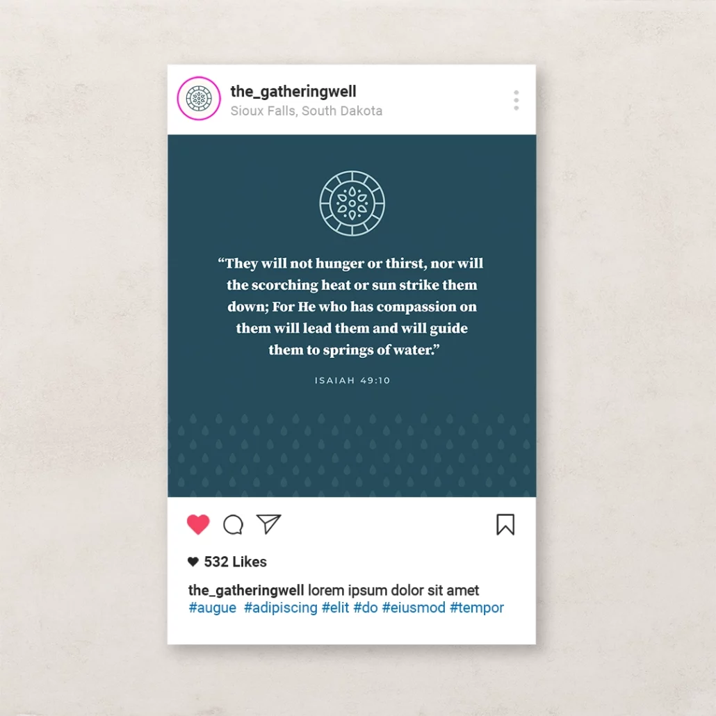
Because The Gathering Well is a small nonprofit, I created marketing tool kit for their team of volunteers to use to maintain consistent branding. The kit included templates for social media posts, presentations, and documents. I also developed a website for them and trained their team on how to use it.
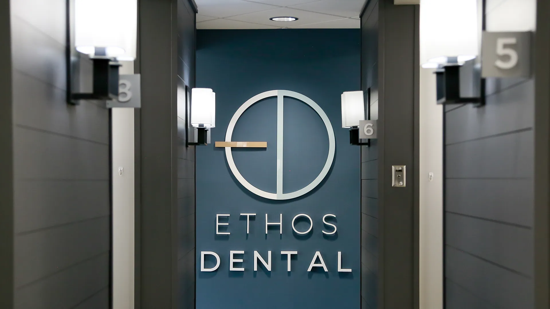
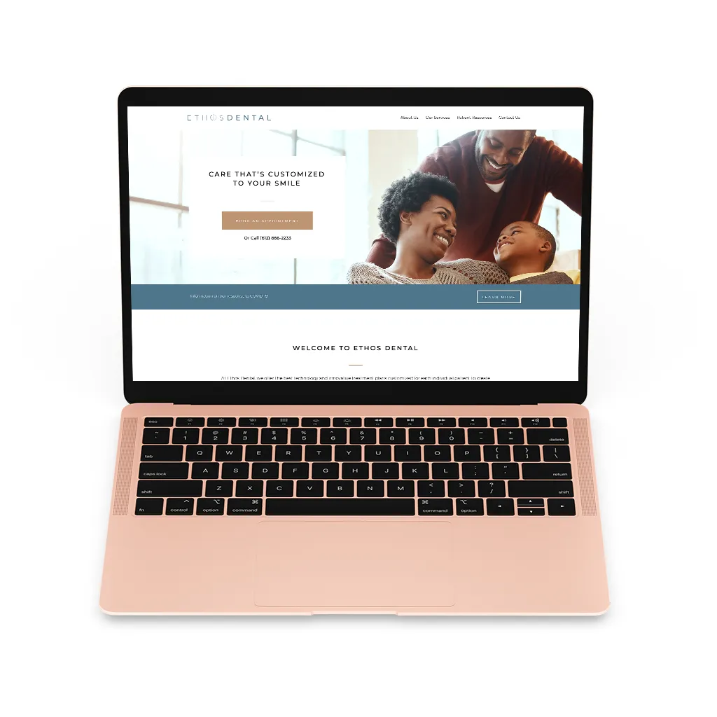
Ethos Dental, formerly O’Neil Dental, is a cosmetic and general dentist practice in Richmond, MN, that was on the brink of a big change. With a new dentist at the helm, a new name, and an office renovation underway, they needed an identity that signalled a new era in their business.
Since Ethos is focused on cosmetic and adult dentistry, the brand needed to feel mature and upscale (no clip art teeth here). The client was drawn to geometric and minimalist designs that I incorporated into the logo design and type choices.
Dental work can also cause a lot of anxiety, so the color palette we settled on is subdued and calming while still feeling rich and upscale.
Headings
Body Text
Dusk
Afternoon
Dawn
Bronze
Tan
Ebony
+ Interior
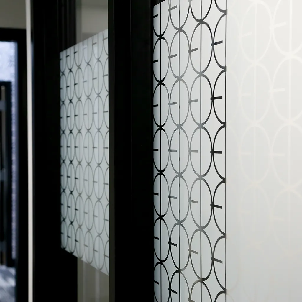
Ethos was also going through a major renovation at the time and they wanted the wanted the interior to feel like the brand. Many of the logo elements, including a custom pattern, were able to be used by their interior design team to accent the space.
+ Website
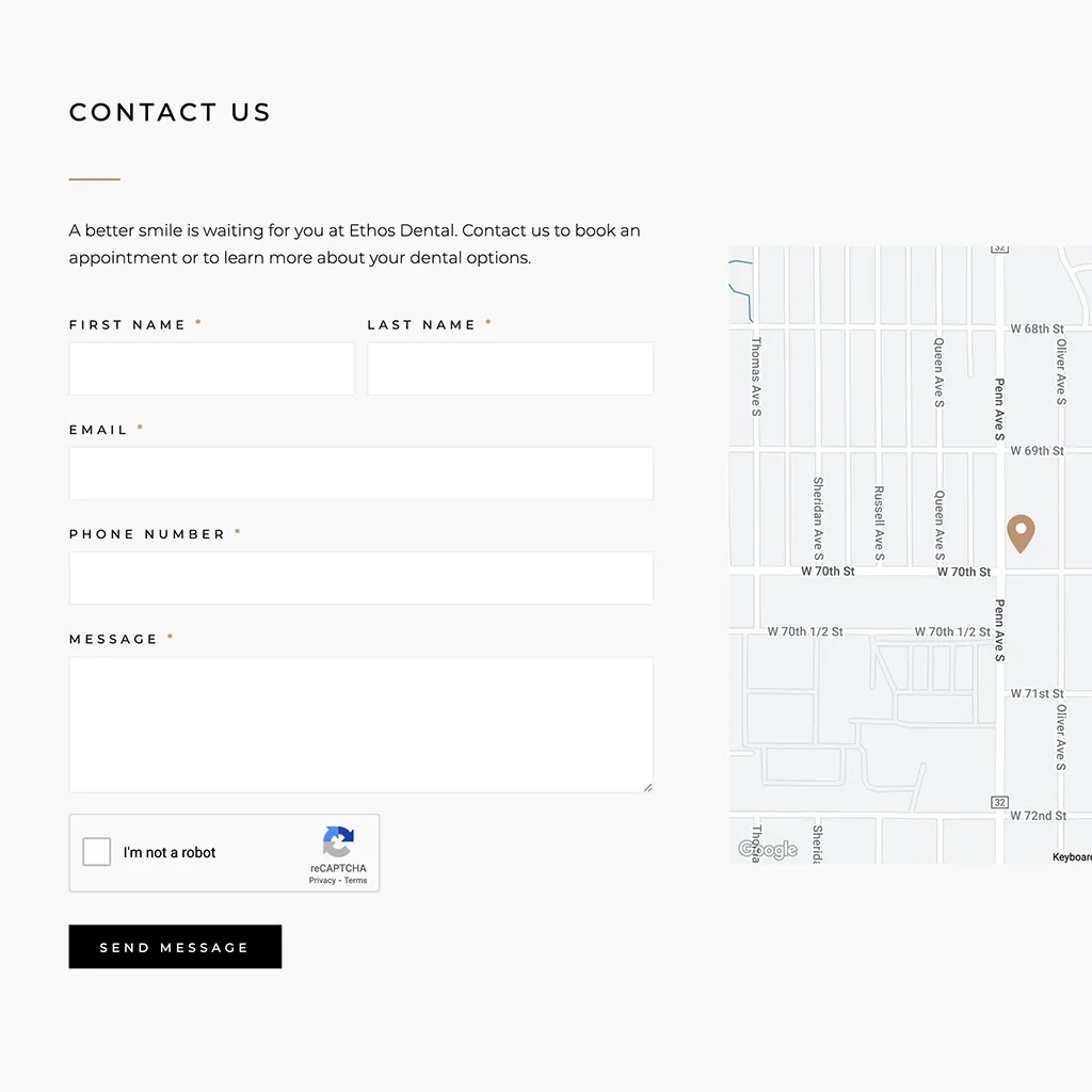
The website was greatly simplified in content to highlight the most important information and was redesigned to express the light, modern feel of the brand identity.
Additional Credits: Interior photography by studioTart.
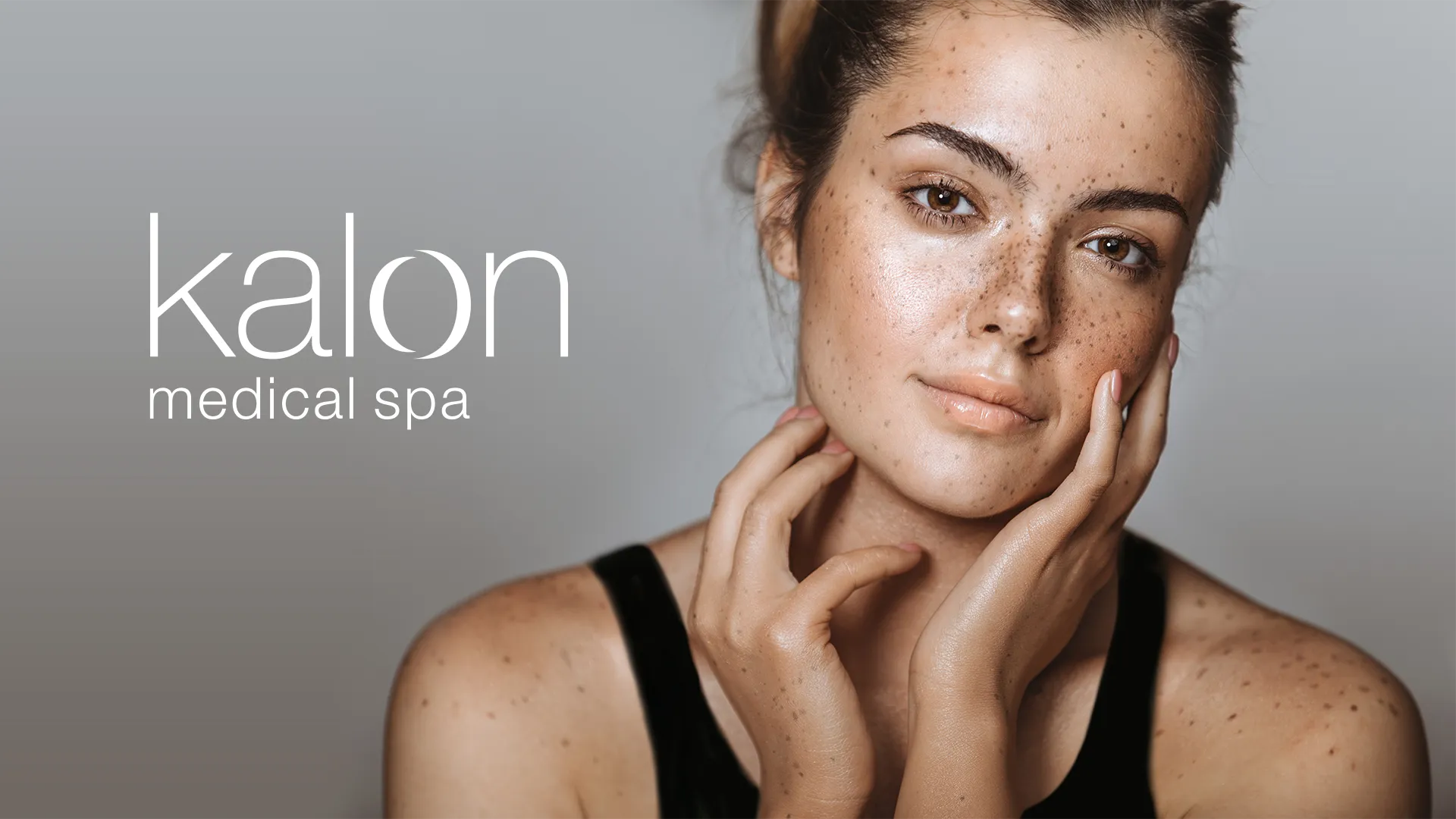
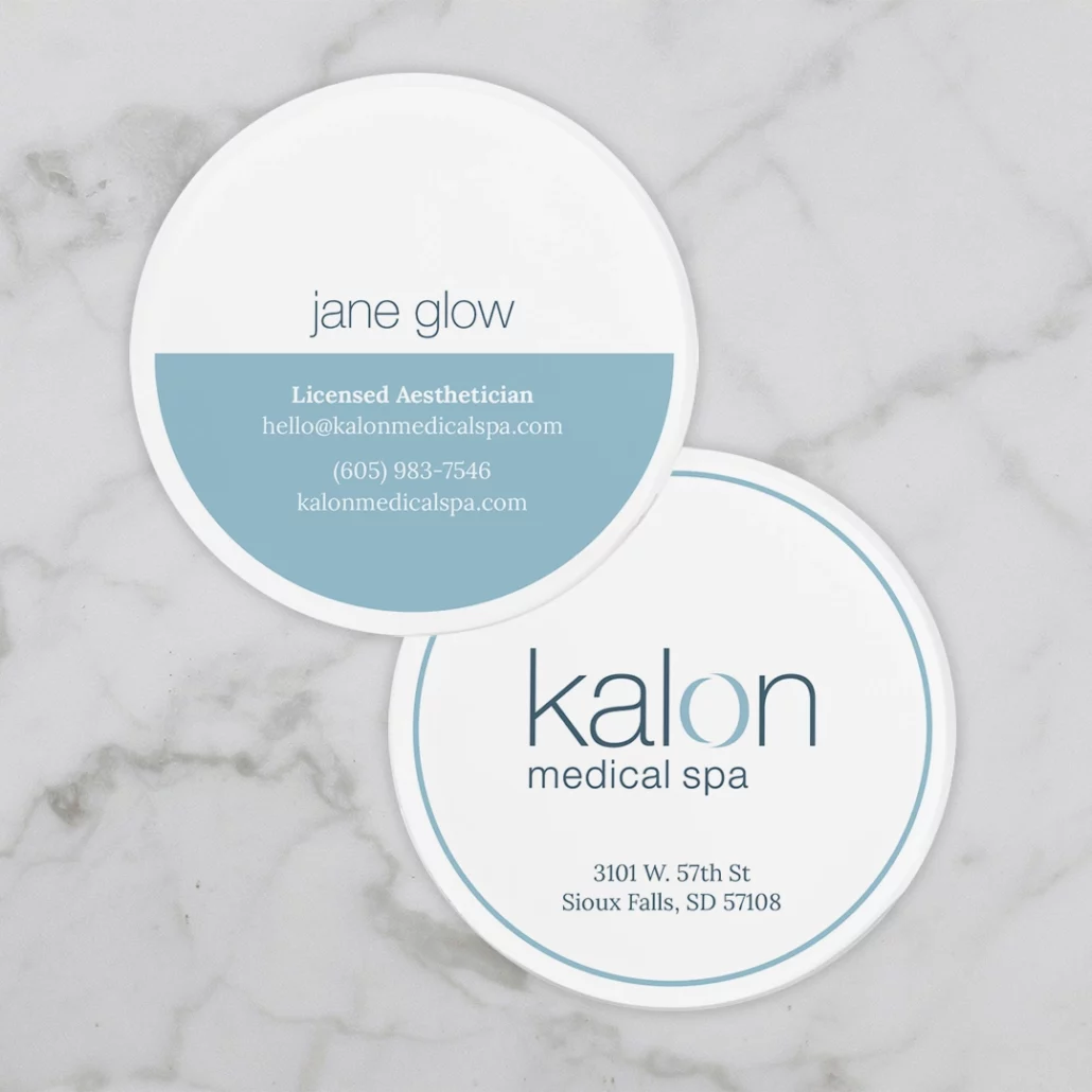
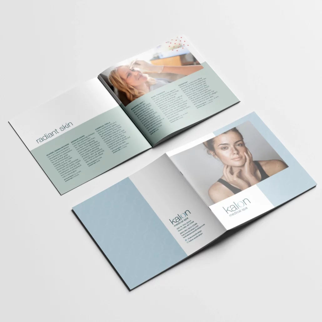
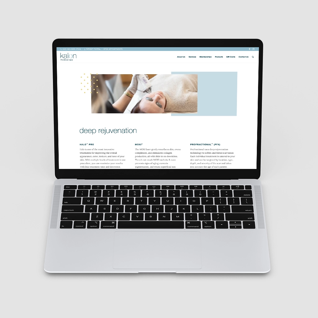
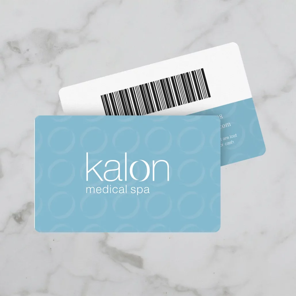
Kalon is a medical spa located inside Vance Thompson Vision in Sioux Falls, SD, that specializes in aesthetics and laser skin treatments. The name was inspired by the Greek concept of “kalon,” which emphasizes the importance of both inner and outer beauty.
For their opening in 2019, I helped them develop a brand that expressed how they want their patients to feel: calm and weightless. The logo illustrates the two halves of inner and outer beauty coming together to form a perfectly imperfect circle. The typefaces chosen enhance the light and airy feel with rounded elements that feel calm and comforting. The colors are inspired by nature to emphasize the idea that Kalon is enhancing, not changing, their patients’ natural beauty.
Once the identity was established, I helped develop the all of collateral needed for their grand opening including a website, brochures, social promotion, and emails.
Headings
Body Text
Accent
Morning Dew
Midnight
Sage
Persimmon
Goldenrod
+ Retail and Promotions
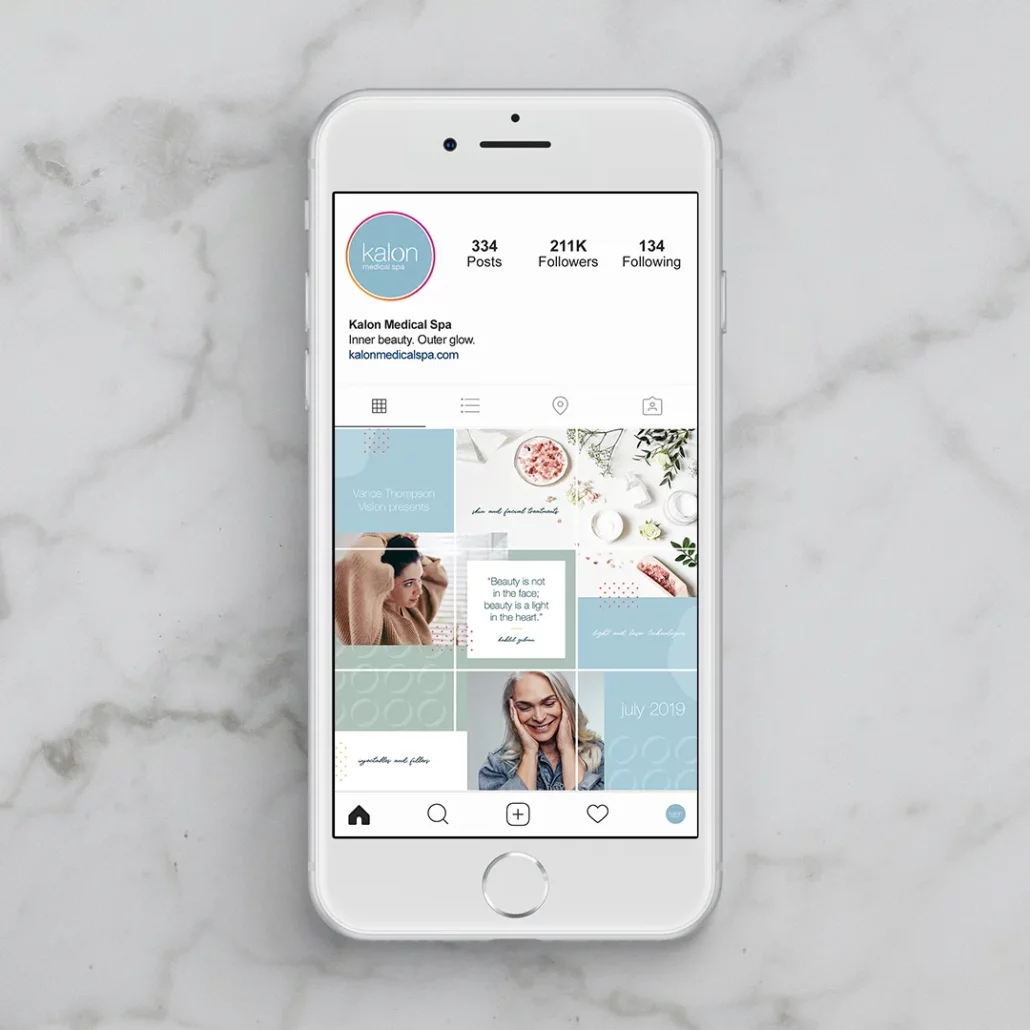
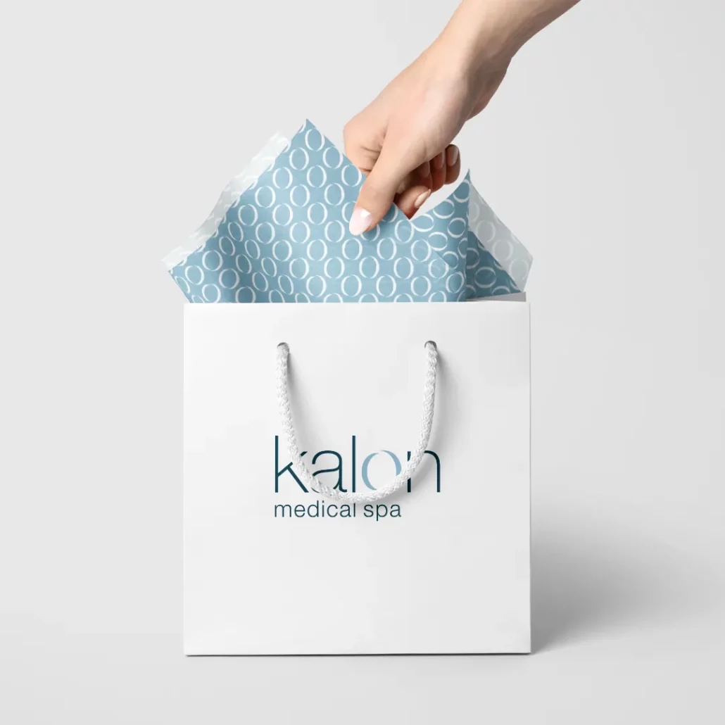
Since their opening, I have continued to work with Kalon to evolve their brand and deliver their inner beauty, outer glow message consistently. In addition to a medical spa, Kalon also houses a retail store for medical-grade skincare so the holidays are one of their biggest seasons.
Every year, I help them create an online gift guide and set up an online store for their annual Black Friday gift card sale. I also helped design their gift card and gift packaging and assist in email and in-store promotion leading up to the event.
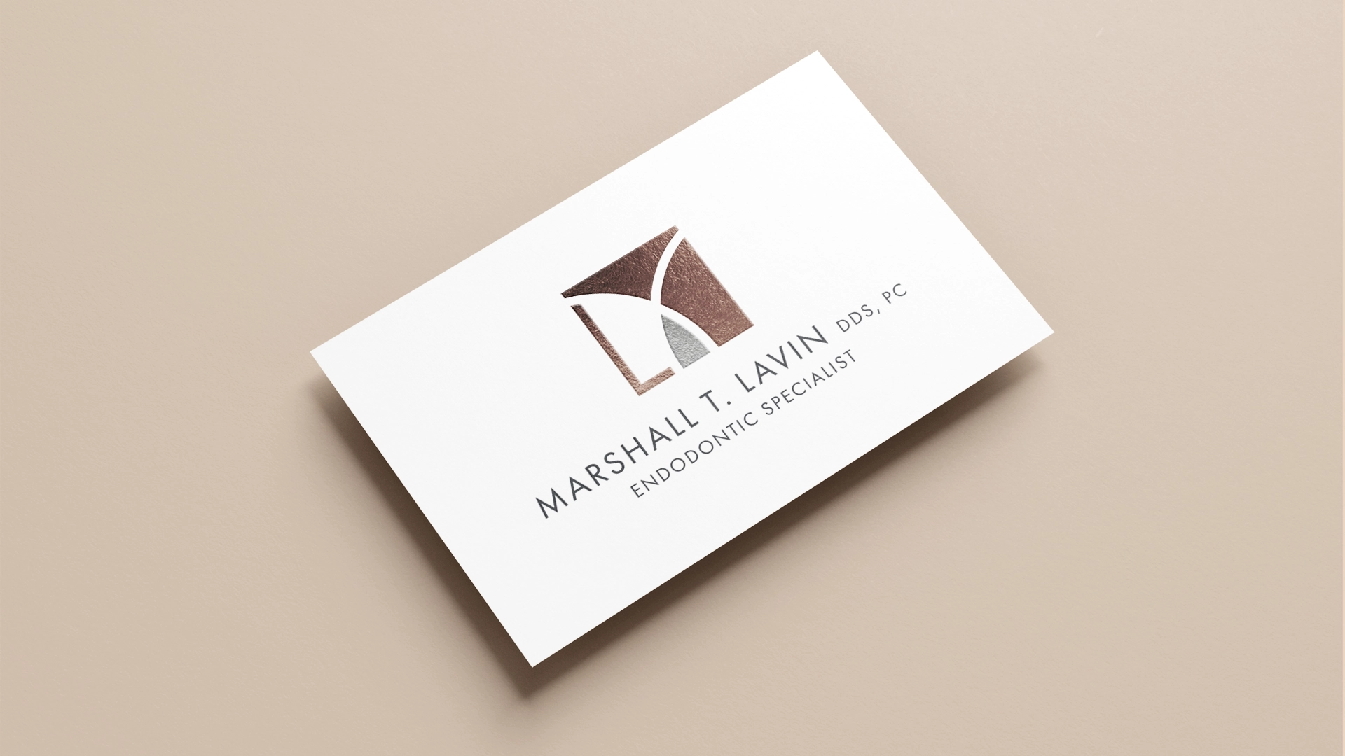
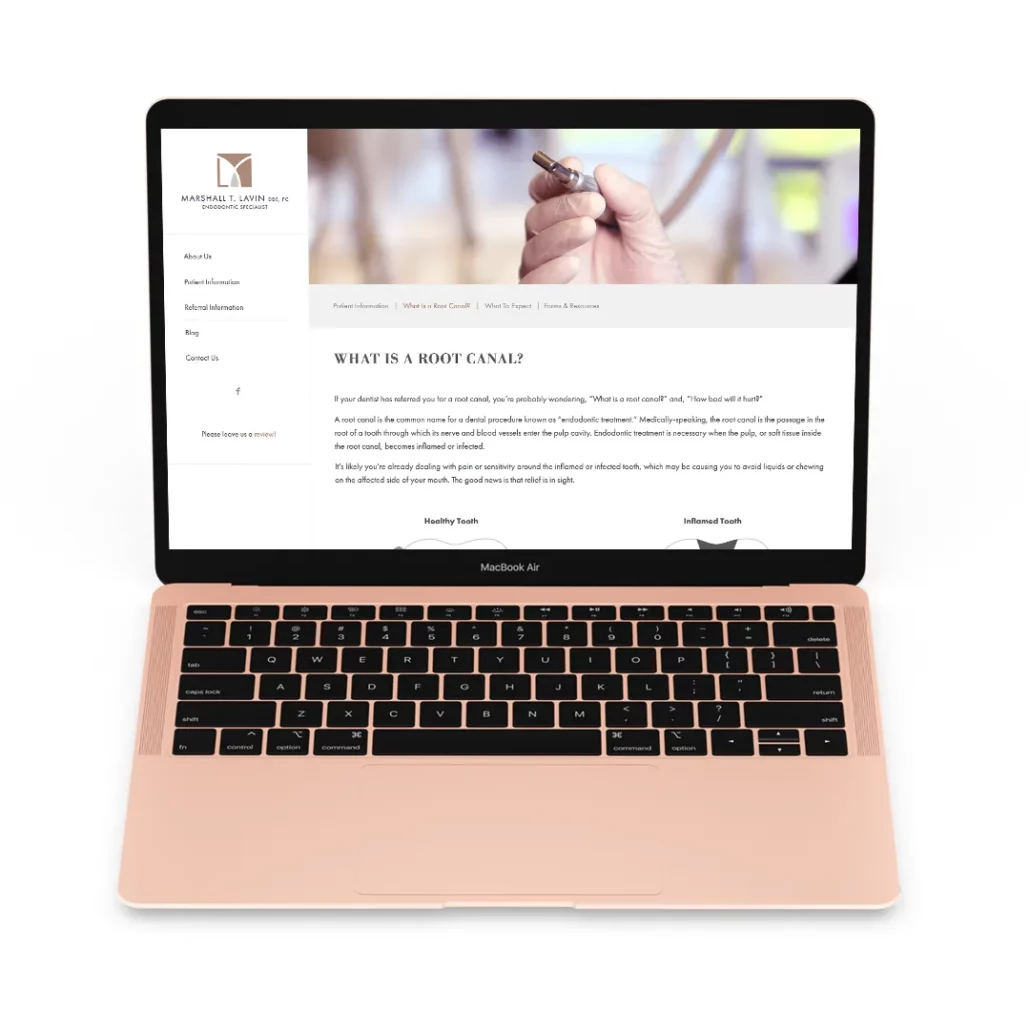
Marshall Lavin is an endodontic specialist in Sioux Falls whose brand needed a refresh. After one meeting with with him, it was obvious that he had a refined taste and a classic sense of style. The brand refresh was inspired by high-end luxury brands and reflected the attention to detail and high level of care that Dr. Lavin strives to provide to each patient.
Dr. Lavin liked his current logo, it just needed a bit of an update. I refined the geometry a bit and simplified the entire mark so that it felt more open and airy. I wanted the logo to feel less dental and more like a luxury fashion brand, so I also wanted it to be a monogram. The previous logo already featured an “M” shape, but I separated the lower left corner to create an “L.”
I also wanted to emphasize the carat shape in the middle because it related the logo back to the idea of extraction, so when I recolored the logo, I made that the only piece in an accent color so that it stood out. The overall color palette for the refreshed brand combined warm and cool colors and was inspired by precious metals.
Headings
Subheadings
Body Text
Rose Gold
Sand
Espresso
Marsala
Charcoal
Pewter
Silver
Oxford Blue
+ Website
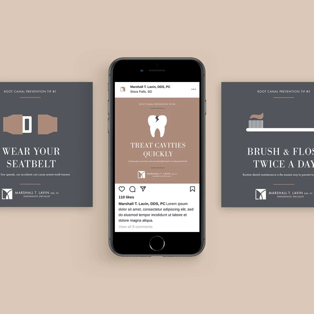
I also redesigned the website to make it feel cleaner and more modern. I wrote new content that gave patients more information about what to expect during their root canal so that they could feel more at-ease going into their appointment.
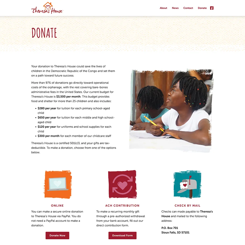
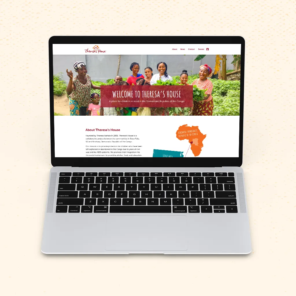
Theresa’s House was founded by Theresa Kashale, who came to the U.S. as a refugee from Democratic Republic of the Congo in 1985. Now a teacher in the Sioux Falls School District, Theresa returned her hometown of Kinshasa in 2006 to start an orphanage for children in need. I have been so grateful to work with Theresa for the past few years to help share her story and the stories of the children she helps.
When I first started working with Theresa’s House, they had a logo but nothing else in the way of a brand identity or consistency. I chose a color palette that complemented the existing logo colors and are inspired by vibrancy of the Congo. The type and illustrations feel intentionally rough and handmade to evoke the playfulness of childhood.
Over the years, I have helped Theresa’s house clearly and consistently by writing and designing newsletters, brochures, and other donor communications. Most recently, I completely redesigned their website so they could share stories and accept donations online—helping them reach a whole new audience base.
Headings
Subheadings
Body Text
Heart
Hope
Sand
Soil
Fruit
River
Sprout
Rain
+ Events
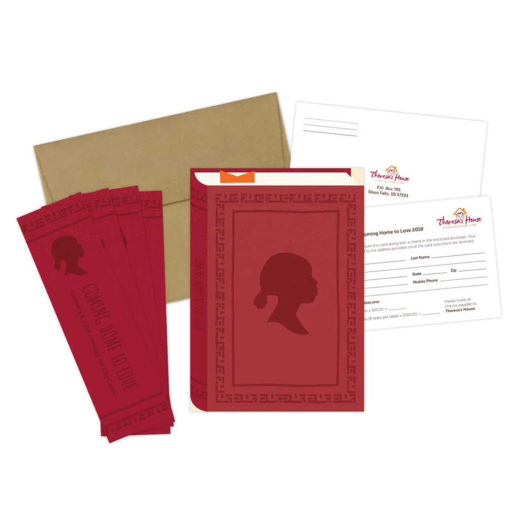
One of the biggest projects I help out with every year is their annual fundraising event, called Coming Home to Love. I attend board meetings leading up to the event to help them plan and strategize.
I also produce all of the event collateral to match the theme of the year including invites, tickets, programs, table decor, and more. Past themes have included “What Will I Be?” and “Be a Part of Her Story.”