OTA Bismarck
+ Background
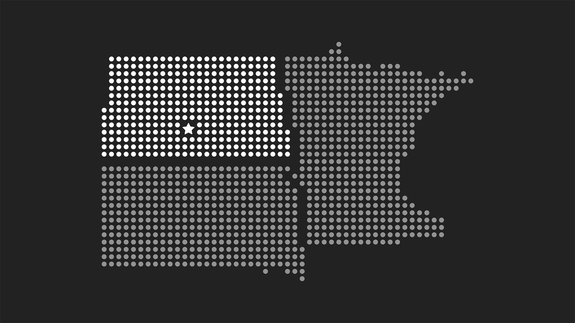
OTA is a nonprofit based in Sioux Falls, SD, that seeks to promote creativity and innovation in often overlooked “OTA” region of North Dakota, South Dakota, and Minnesota. We had the opportunity to work with them to design their 2016 conference in Bismarck, ND.
While most OTA events focus on bringing creatives and thought leaders from across the country to the region, they wanted to try something a bit different for their first ever event in Bismarck. They had recently launched their OTA Builder program which is a fellowship program of sorts for up-and-coming creatives, entrepreneurs, and forward-thinkers who are making connections and growing community throughout the region.
+ Event
For this one-day event, OTA wanted to provide each Builder with a platform to share their ideas and projects with a wider audience, something many of them would not have had the opportunity to do otherwise. This event needed to be something truly special not only for the Builders but also the attendees who came to learn from and connect with them.
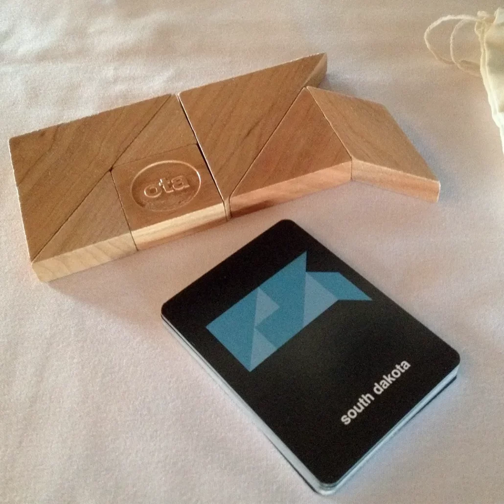
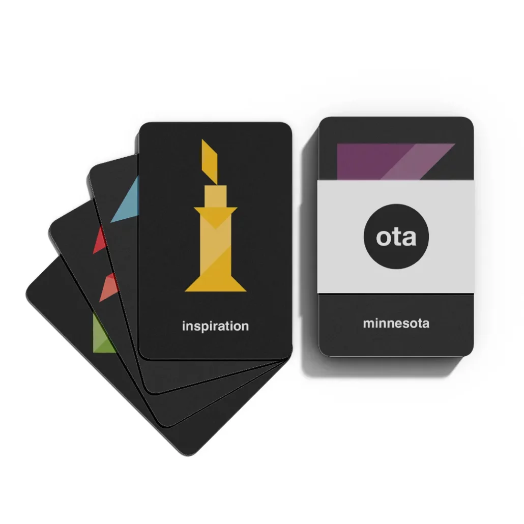
My co-worker, Tim Murray, worked on the physical event space while I designed the logo and all of the print collateral for the event. Inspired by the Builders, I themed the event around the idea of tangrams puzzles. These puzzles feature a finite set of basic shapes but, when combined, the possibilities for what they can be is endless. Similarly, the Builders are using the tools they have to better the region but when they are brought together, they have so many more options open to them.
During the social times in between events, there were custom wooden tangram sets on each table and a set of puzzle cards related to OTA. They were meant to stimulate connection and collaboration and give people a chance to experiment and make whatever they wanted out of these shapes.
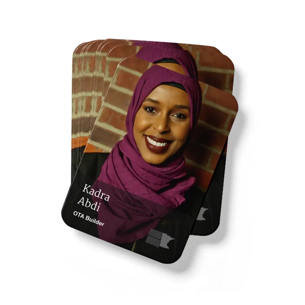
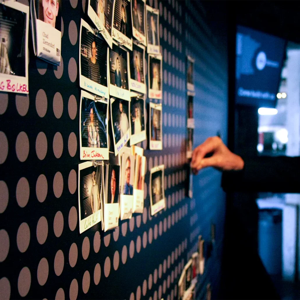
Another way we helped foster connection and a sense of place was a giant map at the entrance of the event. Each attendee took a polaroid and pinned on the map region they were from. Each Builder also had a set of “trading cards” for attendees to take so that it was easier for attendees to approach and make conversation with them.
